MIRROR
Clothing for All.
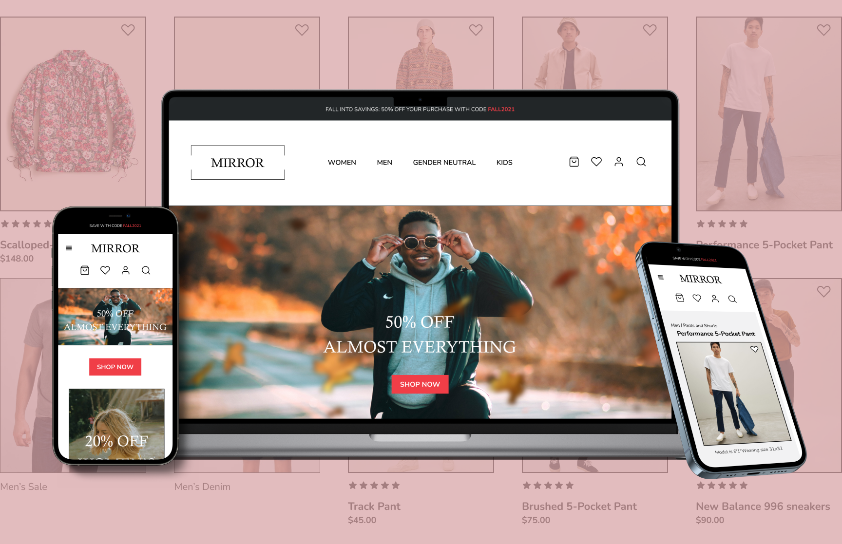
Responsive Web Design
Product Overview
Mirror started back in 1994 as a clothing store targeting a budget-minded audience who looked for low-cost clothing for any occasion. The quality is pretty good and the prices are rather low. Their main goal is to make any type of clothing accessible to everyone. While their clientele has been loyal, the Covid-19 pandemic showed that their customers needed access to online shopping. Mirror must change their website from solely informational, to a full access e-commerce website so its users can order their products online for pickup or delivery.
This case study will go through the UX process of understanding users’ wants and expectations, defining the needs of the design, creating designs, and testing with users for feedback.
Objective
Design a responsive e-commerce website.
Role
Sole Designer
(Start to finish)
Responsibilities
UX/UI Design
Branding
Timeframe
4 Weeks
(approx. 20 hours per week)
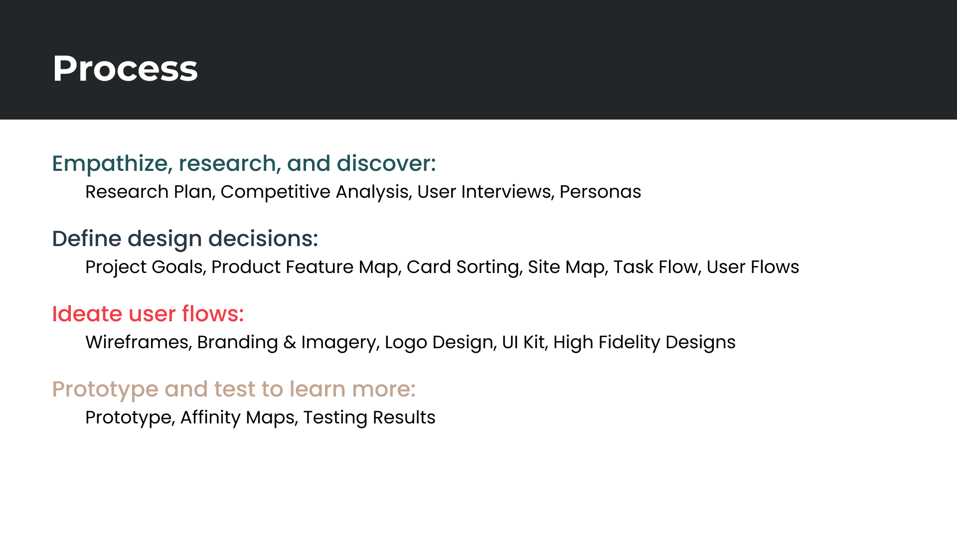
01 Research and Discovery
I want to know what current users expect of an online shopping experience so that I create paths that are enjoyable and efficient.
Research Objectives
What do users want an online shopping experience?
What features attract users to online shopping?
What features create an enjoyable for online shopping?
What steps do users expect while shopping online?
What pain points do users have when shopping online?
Research Methods
Competitive Analysis: This will help me see what’s working (or what's not), and what users are expecting based on other companies' tools.
User Interviews: This will give me insights on users feelings, their thoughts on previous experiences, and their habits when they shop online.
Competitive Analysis Process Overview
I looked at clothing retail stores near Mirror and reviewed the features of their websites.
Competitor needs:
All genders
18-35 years
Lower to middle class
Casual and business casual clothing
E-commerce websites
Primary Competitors
Old Navy
J. Crew
Forever 21
Secondary Competitor:
Target
Competitive Analysis Findings
Users want access to online shopping for safety or to save time
Users want to filter through items quickly and fast checkout options
Users want images with diverse models and reviews of items for reference
Users want the ability to pickup or return items quickly.
User Interviews Process Overview
I interviewed 4 participants through Zoom for 20 minutes asking about their online shopping experiences.
Participant 1:
male
25 years old
barista
suburban home
single
no children
Participant 2:
male
36 years old
self-employed
suburban home
married
1 child
Participant 3:
male
32 years old
teacher
suburban home
married
no children
Participant 4:
female
30 years old
partner manager
urban apartment
married
no children
User Interviews Findings
Users feels comfortable getting clothes in person to try things on
Users are motivated to shop online by the organization and ease of browsing and sales incentives
Users are more trusting of an online shopping experience when there are clear size guides and diverse models
Users want clear return and shipping policies
Younger users want to know about the store’s story and ethical practices
Users use mobile for casual browsing, and desktop for detailed searches
Let’s meet James:
Persona
Based on the findings, I made a persona to represent a certain group of users. This will help me go “What does James need? What is James expecting? What should I be conscious of to give James the best experience?”
02 Design Decisions
Defining the Goals
Once I gathered the research information, it was time to set some goals. First I had to identify the goals of the business, the goals of our user, and the technical goals.

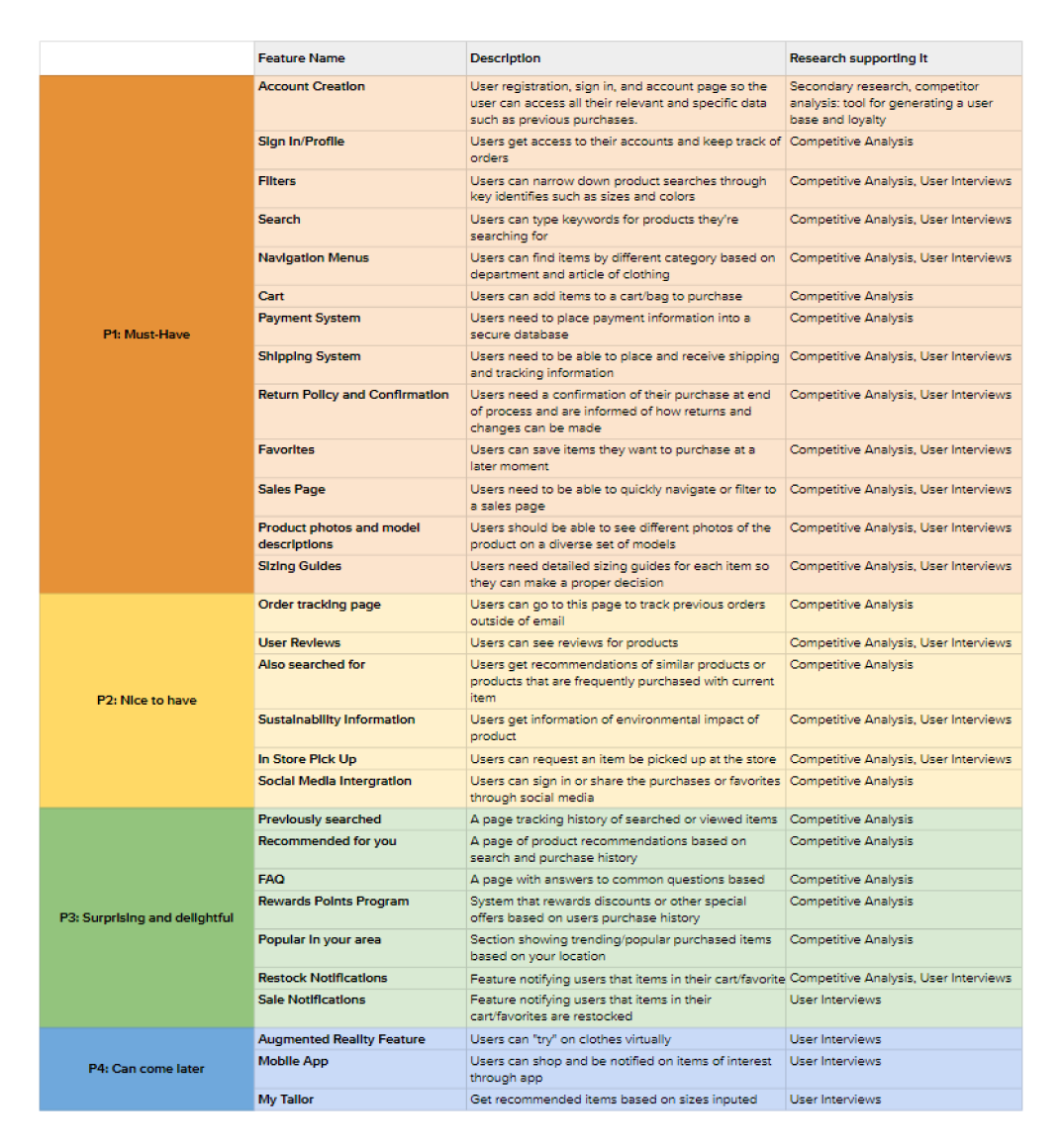
Feature prioritization:
Once our goals are set. I prioritized the features of the products with my rankings based on information from my user interviews and the competitive analysis findings.
Card Sorting
I also wanted to clarify the categories and search tags we may need for the clothing store. In order to do so, I decided to do an open card sorting.
Card Sorting Process Overview
Method: Open card sorting through Optimal Workshop. Shopping items like “black bow tie” “Hoodie” and “boot cut jeans” would be placed into categories created by the participant.
Participants
5 participants
ages 20-36
2 female, 3 male.
Average Time Per sort:
4 and ½ minutes.
Card Sorting Deliverables:
Card sorting Matrix
Dendrogram
Card Sorting Similarity Matrix:
The similarity matrix allows us to see where participants paired items together in the same group more often.
Dendrogram:
The best merge method dendrogram allows us to see larger clusters of items based on individual pair relationships.
Card Sorting Insights:
Participants created a total of 26 categories with a median of 6 categories each
Most common categories were Accessories, Bottoms, Outerwear, and Tops
There was difficulty in the “romper” as most participants created a new category for it.
Most items can be placed in predictable categories that most users will understand or are used to looking for through the navigation menu.
Items will need multiple tags to appear in search results and filters.
Site Map:
Once the features and labeling were decided, I laid them out on a site map to start a big picture.
03 User Flow
With my map, I started thinking of users' flows. I was focused on “WWJD?” or “What would James do?” He would want the minimal number of steps to get his product purchased. Less is definitely more for James.
My first thought was “What if James gets an email and needs pants?
My next thought was “What if James or others wanted to browse around a bit? Where would he go, and what would he need?”
04 User Interface
Wireframes
With all the categories and user flows plotted, I began designing wireframes.
I still kept James in mind, making sure he had the smoothest and minimal steps to reach his goal. Below are the wireframes for the Mirror landing page, a navigation menu, search, product detail page, bag menu, and checkout.

Product Details, Store Bag Overlay, Bag Detail, Checkout wireframes
Branding
I created a mood board to create a high fidelity wireframe. The board helped me look for trendy, casual fashion ideas that helped influence the typography, colors, and logo for Mirror’s rebranding. From the mood board I moved on to a style tile to develop consistency in the high fidelity design.
Logo
I ended up choosing a logo for Mirror that had elements found in other stores with its target market. These logos tend to be minimal. I used lines to create lines reflecting around the word “Mirror”. The lines form the shape of a mirror. The logo then can be adjusted to a horizontal format. For our responsive design, I minimized the logo with a singular capital M while keeping the mirror element with the lines.
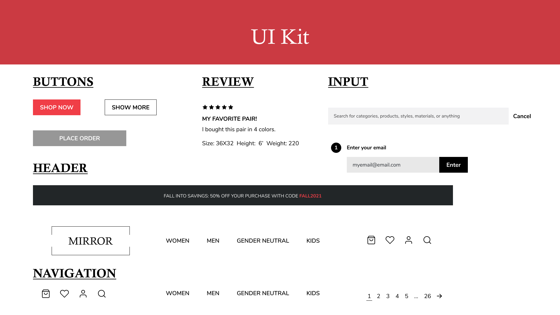
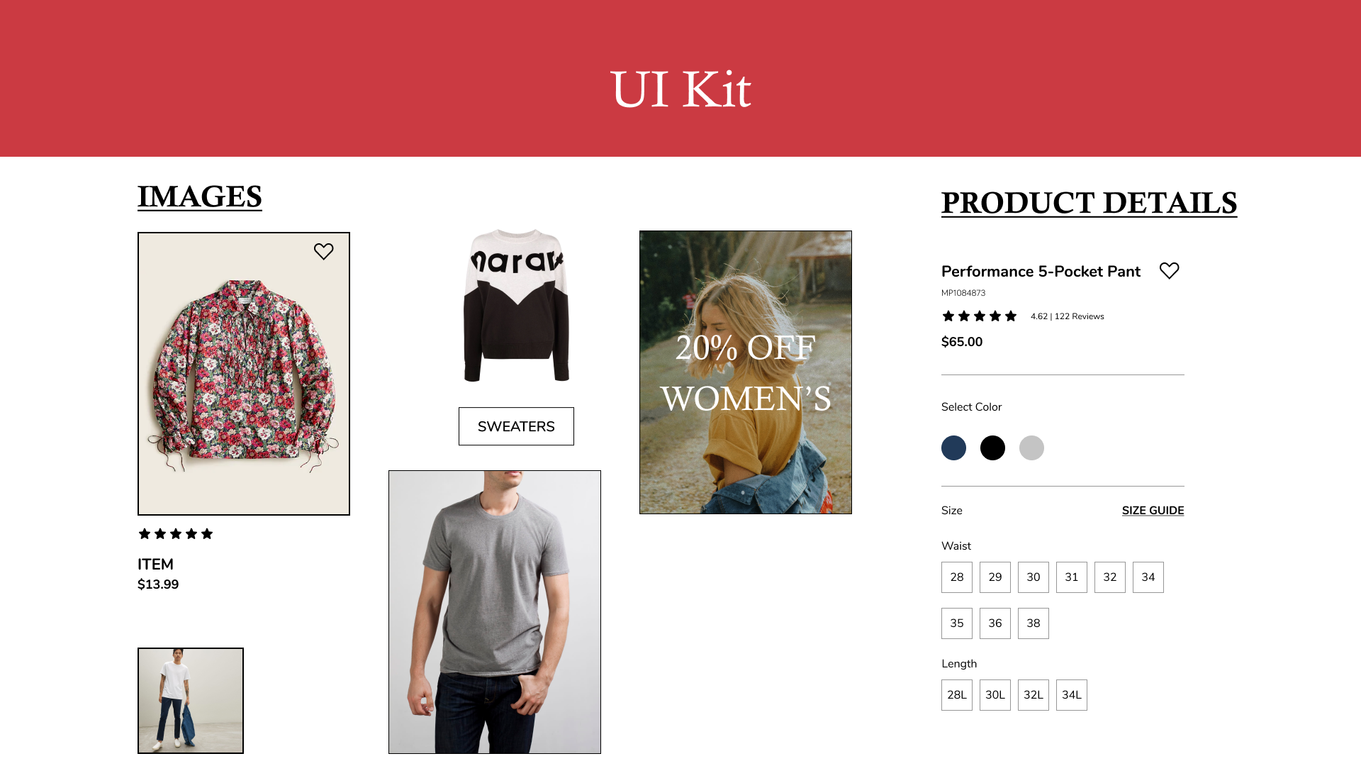
UI Kit
With the logo and style tile, I created a UI Kit for the various components found in the high fidelity design.

05 Test to learn more
Once the high fidelity prototype was created I tested it with users to see if James' task could be accomplished.
User Testing Process Overview
Test Objectives
Determine if users can successfully purchase a pair of pants
Identify the common patterns and flows users take to accomplish the task
Get an understanding of how users feel about the design.
Identify any confusion or frustration the design creates in the task flow
Methodology
Moderated think aloud via zoom.
Number of participants: 3
Age: 18-40 years of age.
2 female, 1 male.
Average Time Per Test:
20 minutes
Deliverables:
Affinity Map
Priority Revisions
Affinity Map
I created an affinity map to organize the information, find trends, and create action items.
User Testing Findings:
Participants enjoyed the design and structure of the pages.
All participants completed the task
There was confusion during the checkout process.
All users used the navigation menu instead of the search function.
Action Items:
Modify the images to make the products more prominent. (Currently the main photo shows models in multiple items which confuse users.)
Review the text in the items for errors to avoid confusion among users.
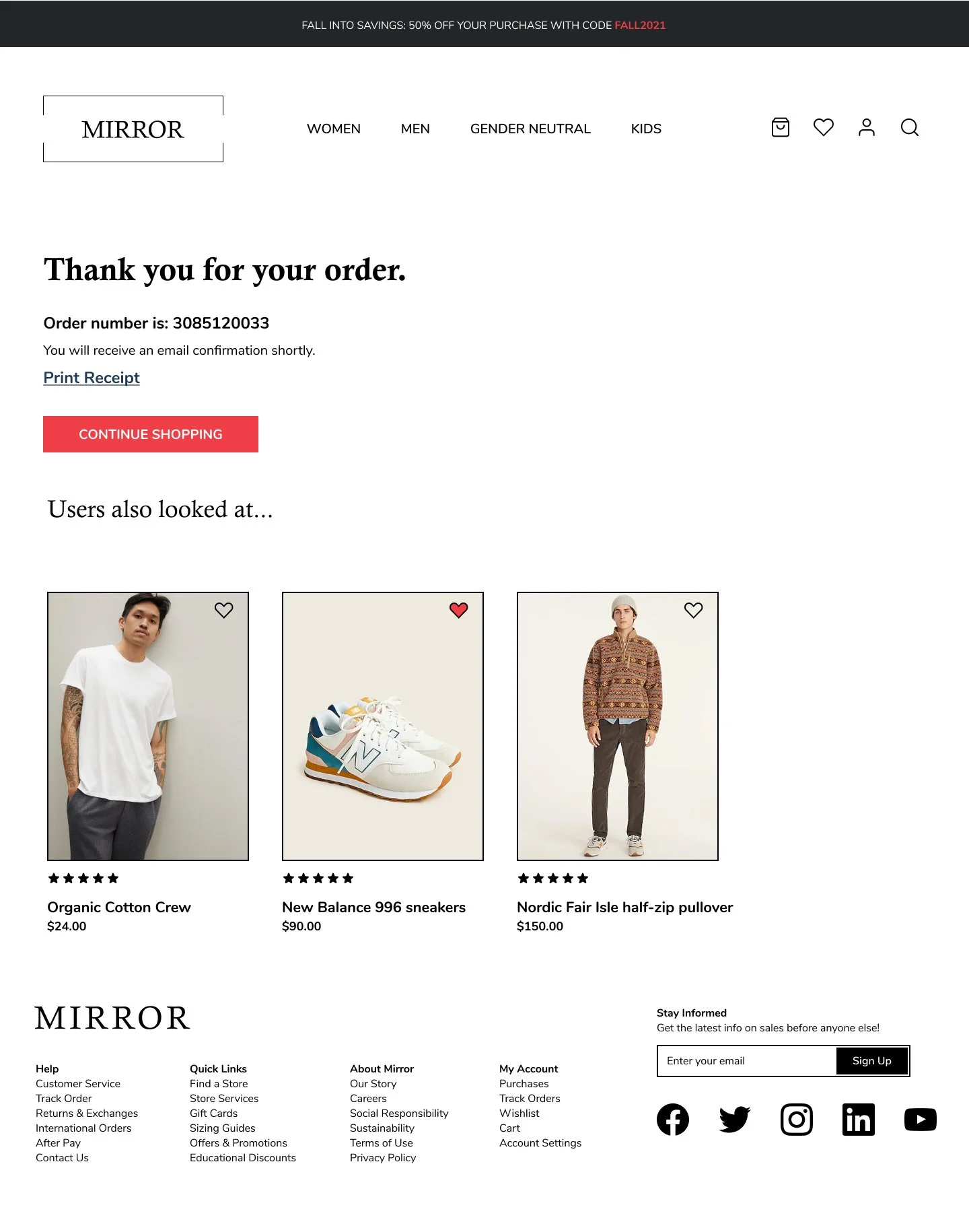
Adding the step/topic headers of the check out process allows users to see a “beginning, middle, and end” of the checkout process. This will help users know where they’re going and be confident about the checkout process. Currently just seeing “email here” confuses users.
Prototype
“Full Screen” or “Fit To Width” recommended.
Priority Revisions:
The most confusing part of the design was in the check out process. Some participants noted that the bag in the original design was too large, making the layout process of the design confusing. They also didn’t see where the checkout process was going. My original intent was to have the design reveal each step as one was completed. Since it just said “enter your email” some users thought it was for an email signup.
Changes Made
The screen was cut in half.
The bag was placed on the left and expanded to allow the possibility of more than a few items.
On the right the checkout process was placed in an accordion menu style. This allows users to see the main steps in the process and toggle through them as needed for checkout.
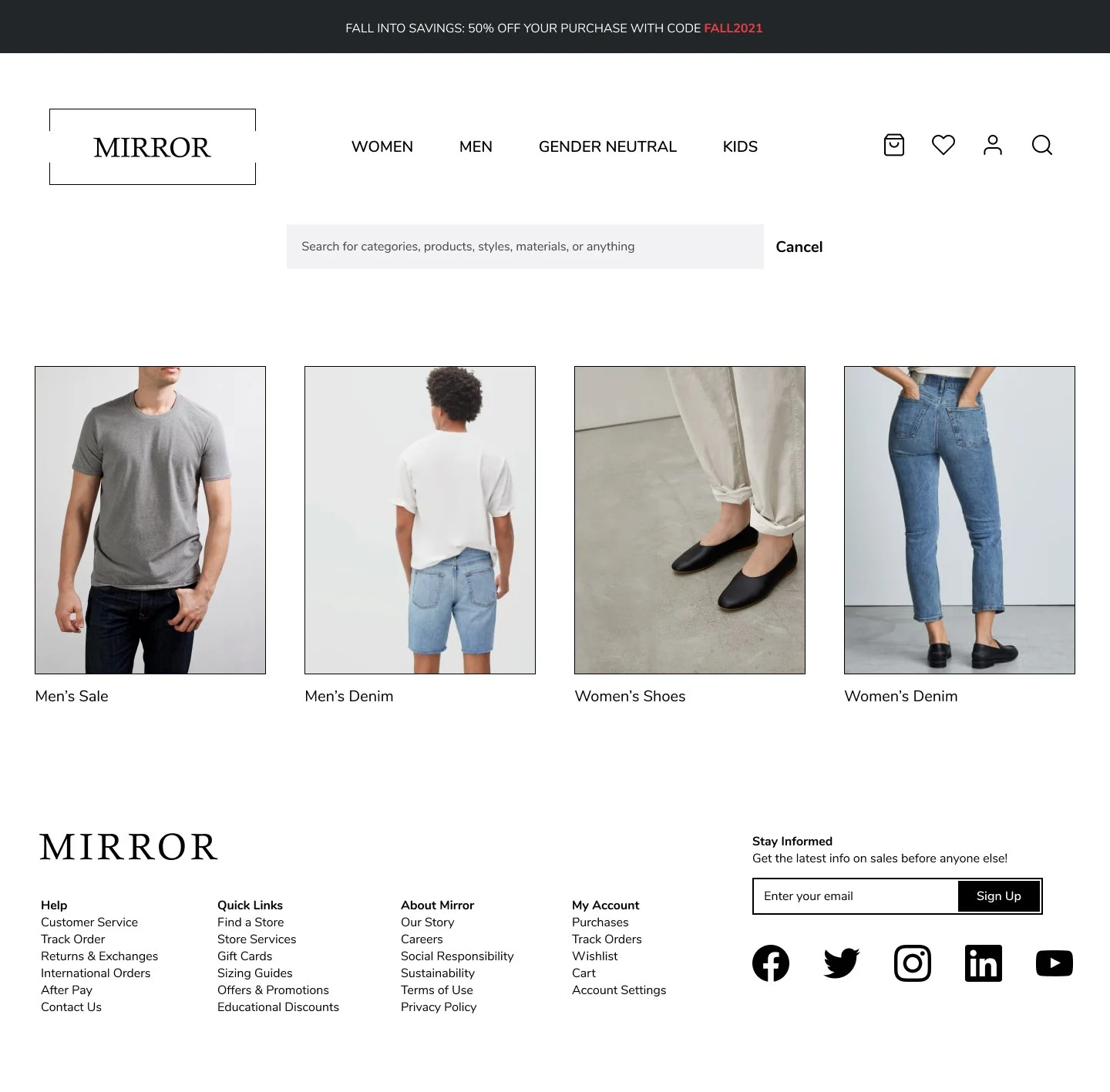
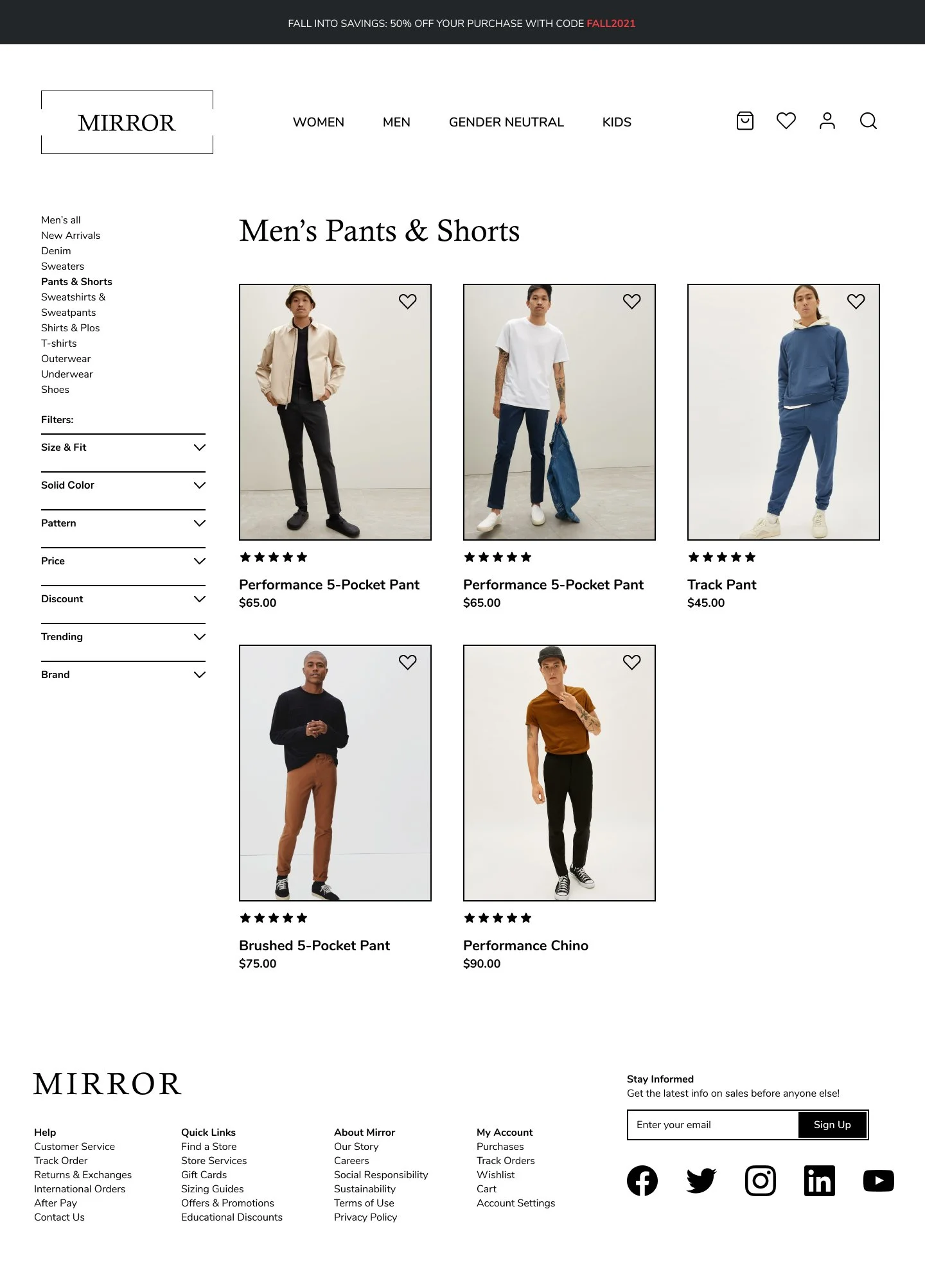
Final Screens


Check out more:
-

a-game
User Experience-additional feature
Gaming, branding, engagement. -

Marcato
Professional networking for musicians.
Responsive web design. -
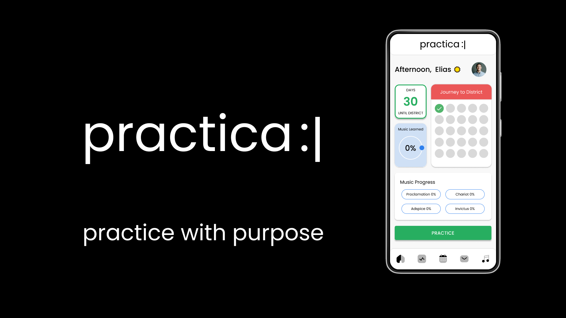
Practica
Ed-tech
Music practice guide -

More about me?
Details below.
✨